Branding
Half Pint
Half Pint Brewing
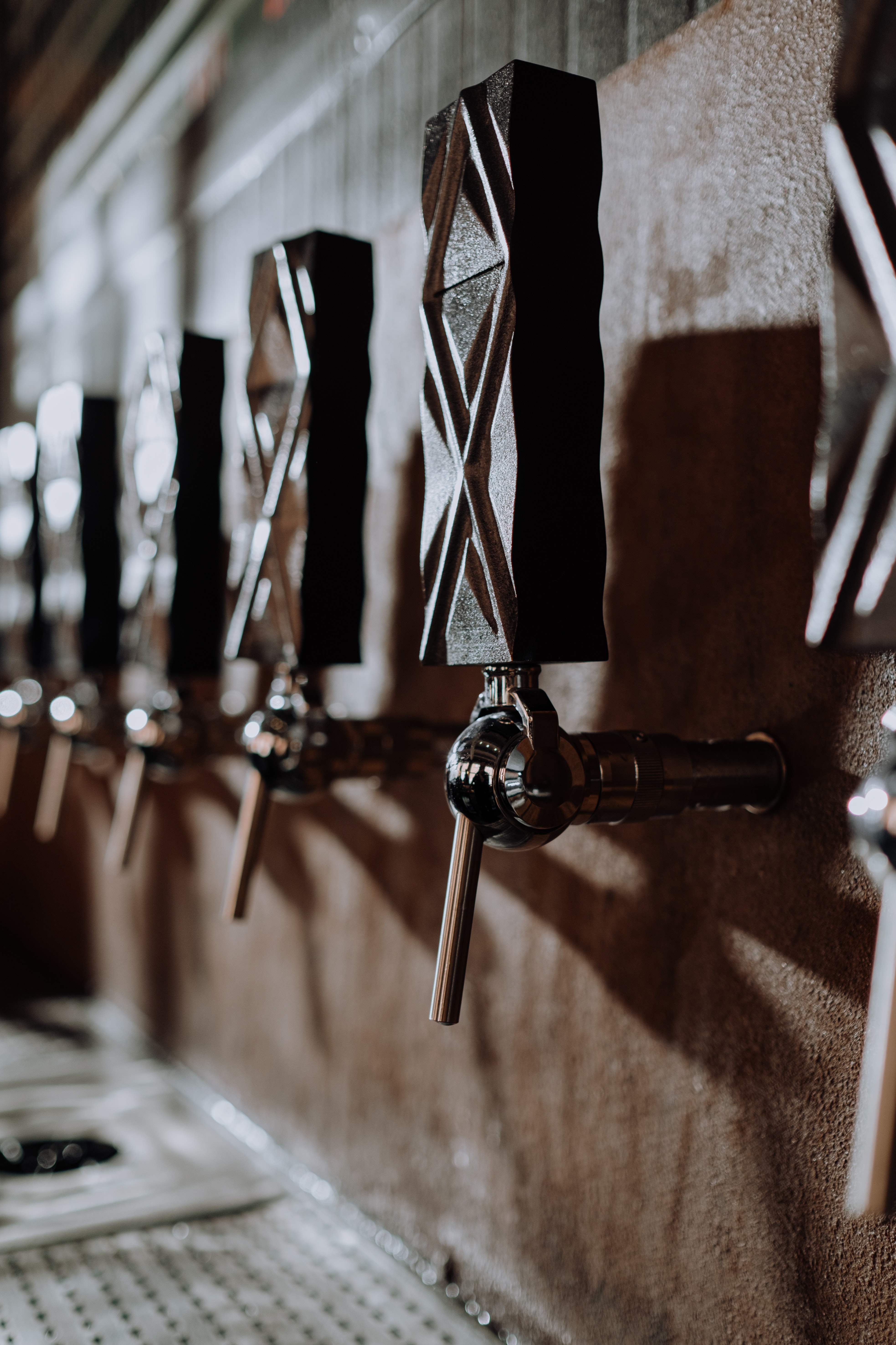
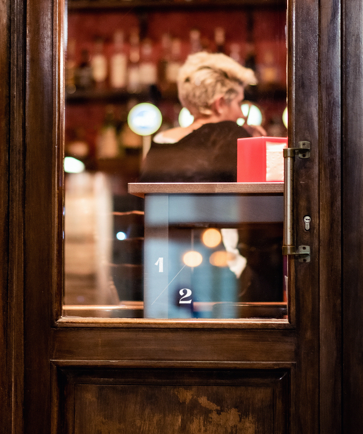
Half Pint is a brewery in Winnipeg and has won many awards for their artisan craft. Attached to their brewery is a taproom where visitors can come try their produce and enjoy a relaxing day with their friends.
MISSION
EXPLORATION
Redesign the logo and brand identity of Half Pint to make it more grown up and share a line of new craft beers.
Before I can begin designing a logo, it was important for me to research the brewing process, as well as the current identity of the clients. With the newfound knowledge, I created 3 moodboards and explored / sketched logos connecting to those moods.
APPROACH
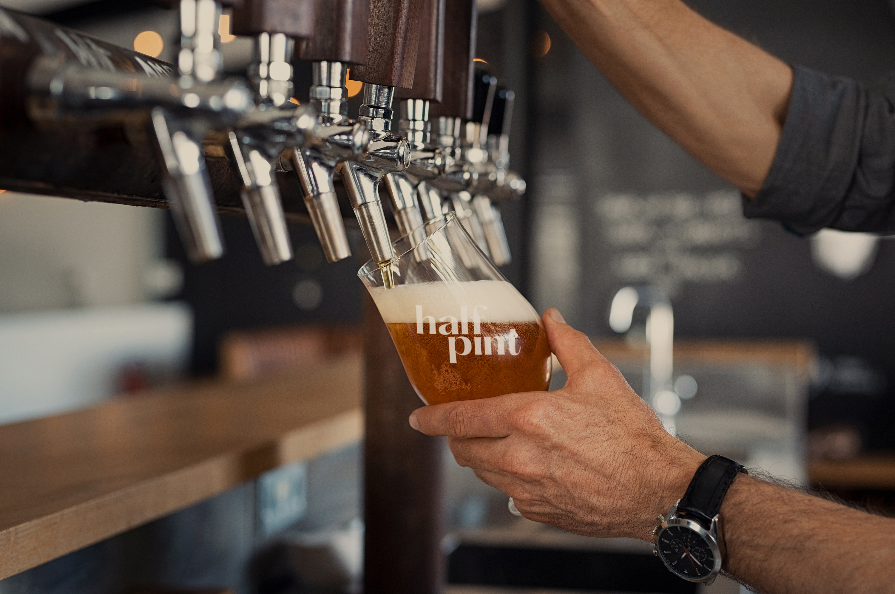
The art of pouring a pint by angling the glass became the main focus and how to convey that in a simple way for a logo without including a visual of the pint so that it can be used to create a strong line extension.
OUTCOME
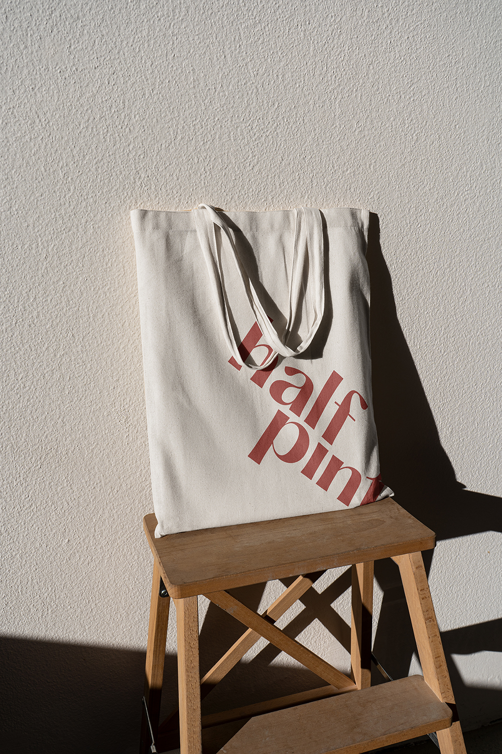
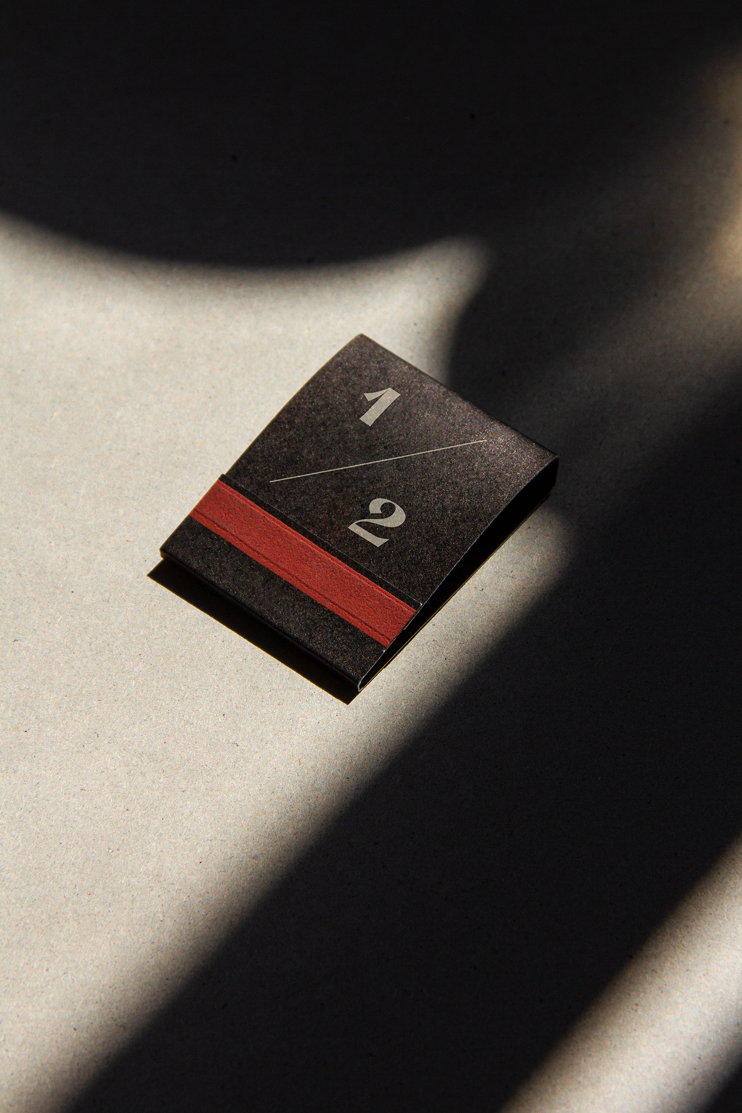
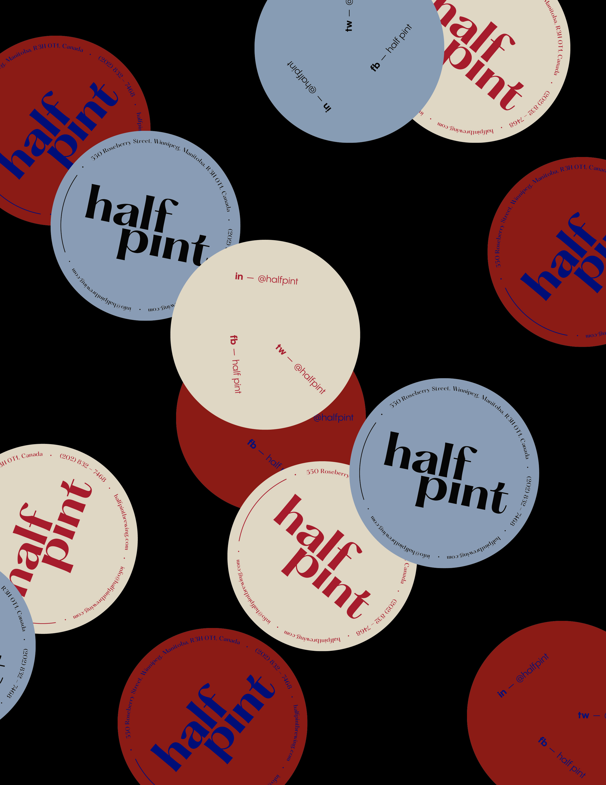
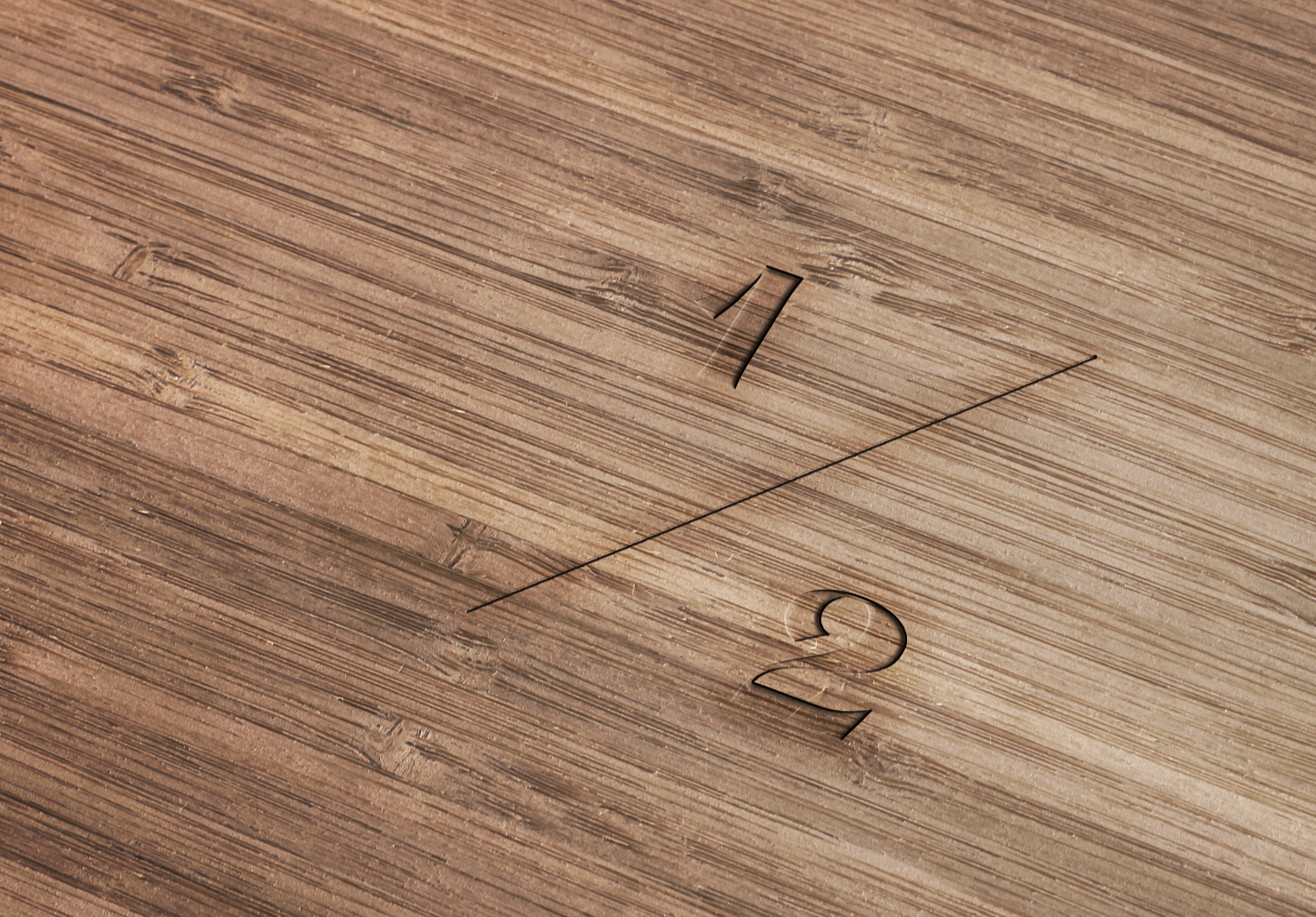
The final logo of the brewery is a logotype in a contemporary take on a classic typeface. The message of the logo plays on the action of tipping your glass when you go for a drink and cheers with your friends. The logo becomes horizontal when it is rotated in connection when your glass is tipped it will line up with the liquid, in this case the brewery’s beer. For an alternative of the logo to be used interchangeably depending on the context, we designed a fraction for the ‘half’ in the same style as the main logo.
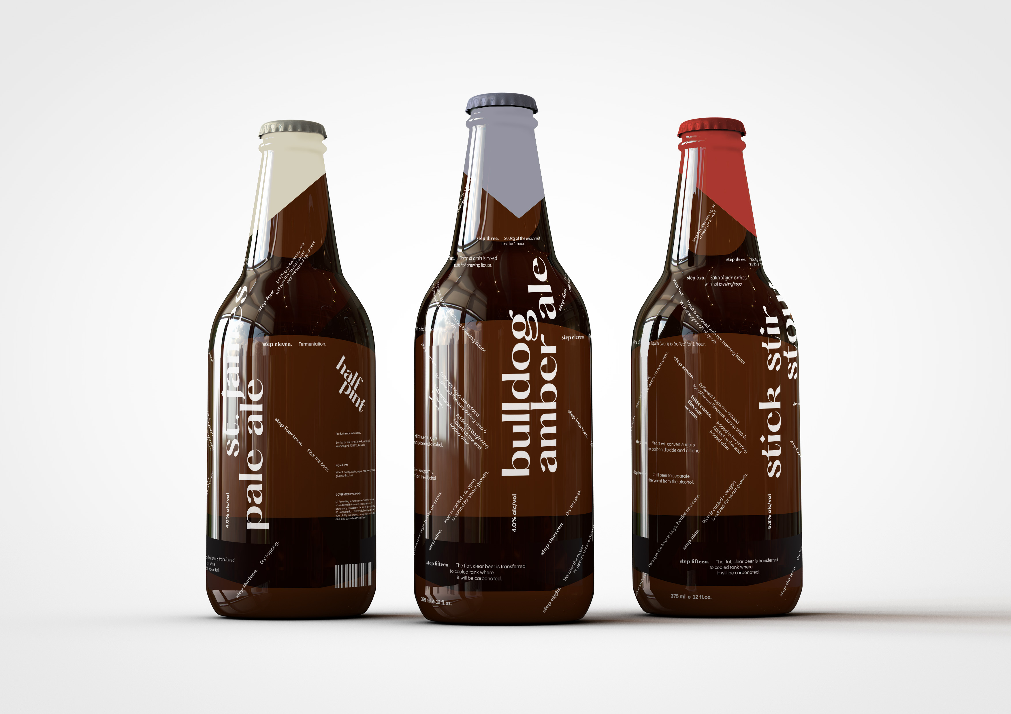
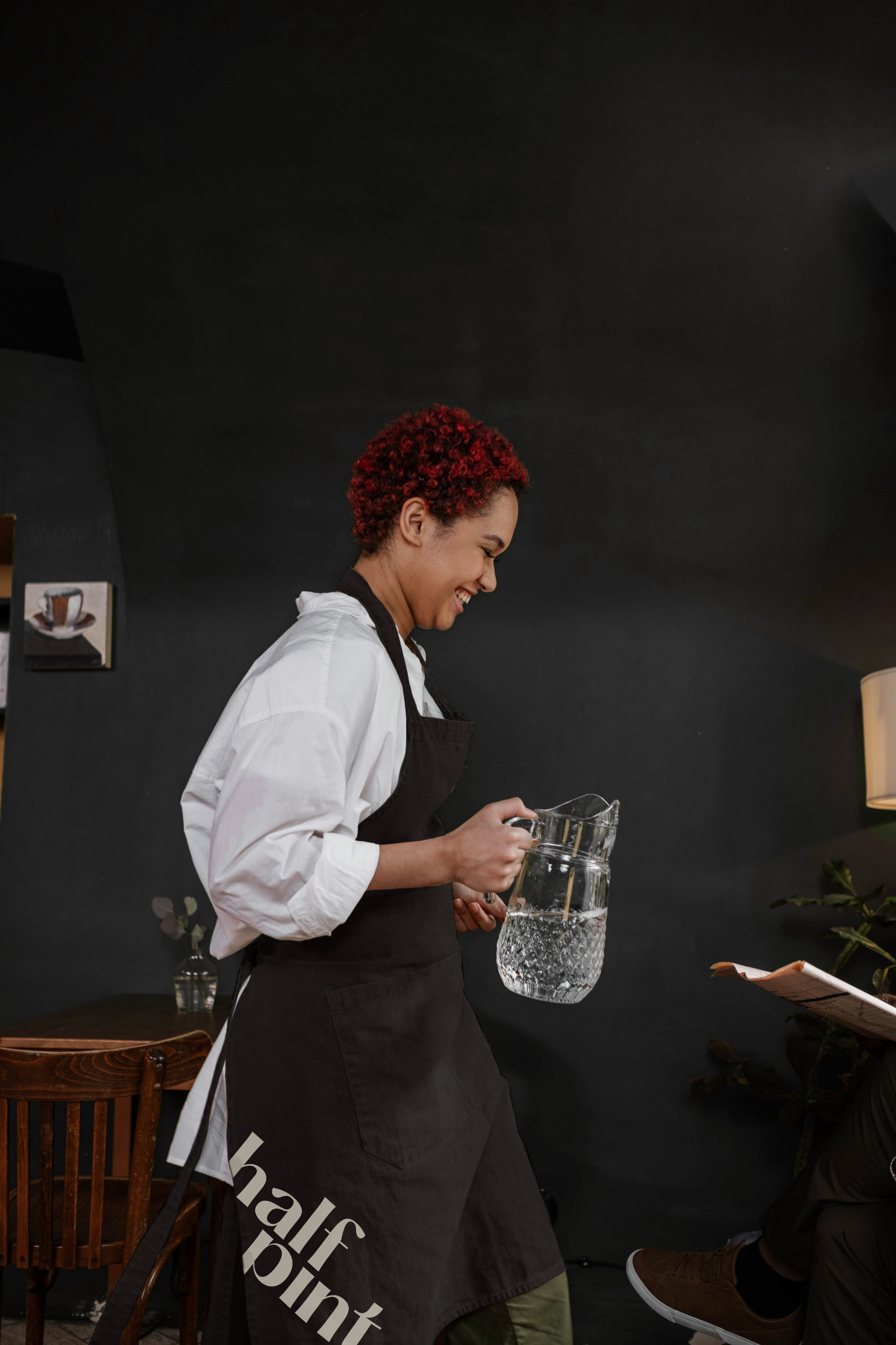
With the new logo, the visual language was applied to many different applications — including their new line of craft beer, bringing in the angled typography and applying it to the bottles with white screen printing.